Sunday 9 May 2010

Evaluation Questions

In what ways does your media product use, develop or challenge forms and conventions of real media products?

My media project challenges the conventions of real media products. I decided to use the conventions of alternative and independent publications such as Vice Magazine, Dazed and Confused, The Journal etc. More mainstream magazines such as MOJO and Q for example often have busy front covers with lots of cover lines, puffs, or in the case of lads magazine lots of orange is used. I prefer the style of Vice, because it only features a cover photo and a logo. I feel that this makes the magazines look better and makes me want to keep them like a book rather than other music magazines that i would give away or recycle. My magazine also used another convention of Vice, that the magazine is free because the cost of the magazine is covered by the adverts. I choose to use this idea for product because I hate paying over £4 for a monthly magazine only for it to be filled with adverts anyway.


How does your media product represent particular social groups?

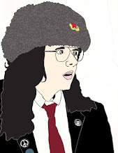
my magazine represent particular social groups through its style. I've tried to create a similar magazine to what I read magazines such as Vice, Dazed and Confused Apartamento, Little White Lies etc. People read these kinds of magazines because of a niche interest. For example Little White Lies is about Independent Films. My media product that I have created is aimed at people that are interested in 1960's counterculture. I've tried to do this throught the typefaces I used inside and the images I have used. The main typeface I have used was in a 1960s style bellbottomed font. I took all the photos myself in the fields near my house of a friend who dressed up in vintage clothing. (the rest of the photos can be found here)


What kind of media institution might distribute your media product and why?

I feel that my media product would have to be self published and only available within a certain area due to the magazine being funded by adverts. `For example if the magazine only contained adverts from local Island businesses the magazine would only be able to be distributed across the Island. However if you had adverts from national businesses or even global ones you could distribute it nation wide. I don't think a major publisher such Bauer would be interested in this magazine because it has such a niche market. If the magazine was independent it would probably be found in local scene shops rather than major chains such as W H Smiths. You would be more likely to find it shops Cheap Thrills which is a local comic book shop on the Isle of Wight.


Who is audience for your media product?

The audience for my media product would probably 18-30 of both sexes. The NRS social grade for my product would probably be grades D and E due to the age of people reading the magazine. This magazine would be most interesting to people who already have an interest into 1960's counterculture. This does mean that the magazine will also probably have an older audience too, of 60+'s would were part of the real 1960 counterculture. These peoples NRS social grades are more likely to Bs and C1s.


Looking back to the preliminary task, what do you feel you have learnt in the progression from it to the full product?

I feel I have learnt about how much attention to detail goes into making magazines. Taking Photos that are high enough quality and then being able to edit them for the front cover is very important to the look of the magazine. Also the use of Typefaces is important. Typefaces need to be clear and legible so that people can read them. Colour connotation is also important for theming magazines for example summer issues will used bright and warm colours compared to a winter issue which might use blues or even a christmas issue which might use reds and greens. Magazines need to have a consistent style running through them to give it a sense of identity. A reader should be able to tell one magazine from another just be looking at its house style.

(link to preliminary task)


Final Designs

Front Cover
Contents Page
Double Page Spread 1
Double Page Spread 2

Double Page Spread Idea

Double Page Spread Research

Here are the same 4 magazines again but this time looking at double page spreads.

First we have Classic Rock and an article about early British Rock Festivals. The article starts with with a large title at the top in two tone with the word APOCALYPSE in red and with faded edges. This gives it a more grungy look. The first word of the article is also larger and more fancy. Under the title is a short summery of what the article is about. this allows a reader to seeing if they will be interested with out having to read the whole thing. the writing on the page is separated into two columns and have selected quotes pulled out and placed bigger in between. These quotes are normally interesting and make the reader what to read the whole article to fully understand the context of the quote. This Double page spread features a large collection of pictures and the has captions which explain what the pictures are about. Also when the writing finishes there is an arrow to tell the reader that the article continues onto the next page.
This was one of the very few double pages inside of Vice, because the magazine features more adverts than the average magazine because it is free. This idea of a free magazine is something i plan to use in my magazine. The Vice article features a collage of pictures on one page with short descriptions under them. The writing is laid out very similarity to Classic Rock. The writing is in two large columns and features large quotes. This is the most common magazine layout and is used by most publications.
Dazed and Confused features a photo with the title of the article over it and the short description plus credits to the writer and photographer. Again the article is set out into columns but because this article is an interview it states the who is talking and reads like a transcript.
Finally in MOJO, again the text is set out in the same way but doesn't contain quote enlarge but rather has a quote over the picture of The Beach Boys. The article also includes some pictures of old records over the the picture. also the pictures are given a white border with a drop shadow.

Contents Ideas

These are two ideas i have had for the contents pages. I tried to different styles, the first is more like the Vice and Dazed and Confused contents pages and the Second is more like MOJO and Classic Rock Covers.


I prefer the second design and will develop this style further for my final contents page. It still needs to have the final logo, credits to people who took photos etc and contact address and maybe a website address.

Contents Research

I've taken pictures of 4 magazines from my room; Vice, MOJO, Dazed and Confused, and Classic Rock

First is Vice. Vices contents page is very simple, it features one photograph from a photographer that has an article inside the magazine and then below that it just has black and white text listing all the article and features inside this issue. Each one has the title in bold followed by a subtitle which gives some idea of what the article is about.
Second is MOJO. I think the MOJO contents page would work better with my magazine because it is a music magazine and features a musician with black and red text on the background of the picture. Each article has the name of the musician or band in bold capitals and the has a short paragraph under that with a short summery. MOJO's contents also features the magazines logo at the top of the contents.
Thirdly is Dazed and Confused. Another magazine named after a song (this time Led Zeppelin) has a contents page similar to Vice. It uses a photograph with black and white text under it, however the text is overlapping the picture on this contents with blocked in white behind it. It also credits the cover photographer and talks about what is featuring on the magazines website this month. also features a logo at the top.

The last is Classic Rock. Classic Rock uses a large black and white photo of Jimi Hendrix on the contents pages with white text relating to the article about him and then everything else is inside a white box with black text in a very similar style to MOJO. It doesn't feature the magazines logo but does have the date and issue number at the top under the word contents.

Front Cover Ideas 3 - Midnight Rambler

My third idea is for a magazine called The Midnight Rambler. The idea behind this magazine was to make a magazine similar to Rolling Stone. For all three of my magazine ideas I have taken the names of songs for the titles just like Rolling Stone which takes its name from the Muddy Waters blues song of the same name. (The Rolling Stones also took their name from this song) The title of this magazine is taken from The Rolling Stones song The Midnight Rambler.


For this magazine I wanted to have more of a 60's kind of feel to it. I looked at this late 60's/ early 70's issue of Rolling Stone for more ideas. I like how simple the cover design is and it reminds me of the modern covers of magazines like Vice which don't have overly cluttered covers.

Here are two drawings of how I want the basic idea for the cover to look.

I then made a quick mock up of what the cover could look like. I took some photos of my friend Jess wearing some 60's inspired clothes and then quickly added some text over the photo in photoshop.
Out of the three ideas for different magazines this one is my favourite and i will continue to develop this one.

Front Cover Ideas 2 - Jail House Rock

My second idea is for a magazine called Jail House Rock. The idea behind this magazine was to make an independent niche magazine about musicians behind bars. The interview feature each week would be with a someone who was in prison or had been at some point. I took the name Jail House Rock from the title of the Elvis Presley song of the same name, however I was inspired by The Blues Brothers Version.


Here is an unfinished idea for JailHouse Rock. I used a free typeface from Dafont.com to create the logo and i then took photos of me and a friend for the cover. The cover would still need to have a bar code, price etc added to it. It would also need to have at least one cover line relating to the interview or story.

Friday 9 April 2010

Front Cover Ideas 1 - Boogie

The first idea I had was for a magazine called BOOGIE. The idea behind this magazine was to be something similar to Vice Magazine, having a set theme for each issue. For this issue I decided to make the issue about Teddy Boys. I took the name Boogie from the title of a Crazy Cavan and Rhythm Rockers song 'Gonna Rock, Gonna Roll, Gonna Boogie'.

For the layout i took inspiration from a 1960's Concert poster for Jefferson Airplane and Big Brother and the Holding Company.

I liked the style of lettering and the way it was shaped around the picture in the middle. I then drew a layout design for my magazine. I decided to use only two colours; light pink and black.

I then made a really quick mock up of what the cover could look like. I took a quick photo of me wearing a pair of Brothel Creepers with my webcam and then drew some rather wobbly letters around the picture using WordArt from Microsoft Word. If I was to develop this design further I would not use WordArt or a webcam on the final product but would draw the letters by hand or create them entirely in Photoshop and would use a much better camera to take the photo.

Tuesday 16 March 2010

Research - Online Magazines Street Boners and TV Carnage

STREET CARNAGE is mostly a website that features street fashion critiques called STREET BONERS and compilations of bad television called TV CARNAGE. The site also has a blog, a radio show, and regularly features video shorts made by Gavin and Derrick.
STREET CARNAGE is also a live presentation you can have in your town where Gavin shows a Street Boners "Best Of" and Derrick shows his latest TV Carnage endeavors.
STREET BONERS will eventually be compiled into a huge book which will feature hundreds of pages of Boners as well as contributions from Chloe Sevigny, Debbie Harry, Fred Armisen, Tim & Eric and many more.

Research - Online Magazines Platform

About Us
Platform is your new favourite magazine, you like us because we’ve sorted out your sex-life, told you what not no wear, and asked the questions you wanted to ask her. We celebrate everything great about being young; sex, music, style, life, and probably a whole lot more. We want to do things for ourselves, stay independent, make money, and most of all; have fun.

Research - Online Magazines Cracked

Cracked is an American comedy website, and was originally a humor magazine. Founded in 1958, Cracked proved to be the most durable imitator of the popular Mad.
In print, Cracked blatantly copied Mad's layouts and subject matter. An article on Cracked.com, the magazine's official website, explains that the magazine was "created as a knock-off of Mad magazine just over 50 years ago," and it "spent nearly half a century with a fan base primarily comprised of people who got to the store after Mad sold out."
Cracked's publication frequency was reduced in the 1990s, and was erratic in the 2000s. In 2006, the magazine was revived with a new editorial formula that represented a significant departure from its prior Mad style. The new format was more akin to "lad" magazines like Maxim and FHM. The new formula, however, was unsuccessful and Cracked again canceled its print magazine in February 2007 after three issues. As of 2009, the brand exists solely as a Web site.

Research - Vice


Vice is a free magazine and media conglomerate founded in Montreal, Quebec and currently based in New York City. The magazine covers contemporary indie and youth culture. Vice is known for its controversial content and often strikes a sardonic and ironic pose on debauchery, sex, drugs, violence, crime, and social issues involving race and economic class.
Vice is available in 19 countries. Editions are published in Canada, Austria, Australia, Belgium, Bulgaria, Brazil, Czech Republic, France, Germany, the Netherlands, Italy, Japan, Spain, Mexico, New Zealand, Scandinavia, the United Kingdom, South Africa and the United States. It is free and supports itself primarily through advertising. The current editor is Jesse Pearson in the U.S. and Andy Capper in the UK.
http:// en.wikipedia.org/wiki/Vice_(magazine)

I used to read Vice and thought that it would be good to use in my research because it is different from the mainstream magazines. I much prefer the Vice covers to the MOJO and NME covers, because it is much more minimalist and makes me want to hold on to the issues after i've read them, rather than something like NME which i'm much more likely to throw away or just cut up.
http:// www.viceland.com/uk/
The Vice website is very important to the magazine, it features archives of back issues, a blog, a photo blog and allows interaction between the magazine and its readership.
Vice has also expanded its brand into other areas including;

Publishing
The magazine has published the collections The DOs and DON'Ts Book and The Vice Guide to Sex and Drugs and Rock and Roll. In 2008, The Vice Photo Book was released, a collection of the most powerful photography published in previous editions of Vice.

Clothing
Vice has created a retail clothing chain, Vice Retail. Vice also has strong ties with clothing line American Apparel, a frequent advertiser in Vice Magazine.

Record label
Vice Recordings has released albums and singles, mainly in the U.S. market, by The Black Lips, Bloc Party, King Khan and the Shrines, The Streets, The Raveonettes, 120 Days, Justice, The Stills, Death From Above 1979, Fucked Up, Chromeo and Charlotte Gainsbourg.

Television and film
VBS.tv is available for viewing on the internet, with the intention of circumventing network intervention over content issues and allowing for a global, free-of-charge distribution plan akin to that of the magazine. Vice Films released a feature length documentary, Heavy Metal in Baghdad, in 2008 as well its first theatrical release entitled White Lightnin' in 2009 and a documentary on professional bull riders entitled The Ride due out in 2010.

Venues
Vice also runs a pub and music venue in Shoreditch, East London, The Old Blue Last

Research - Kerrang! & Q


Kerrang! is a rock music magazine published by Bauer Consumer Media in the United Kingdom. The magazine's name is onomatopoeic and refers to the sound made when playing a power chord on an electric guitar. - http://en.wikipedia.org/wiki/Kerrang!

Q is a music magazine published monthly in the United Kingdom, with a circulation of 130,179 as of June 2007. Q's current editor is Paul Rees, former editor of the UK edition of Kerrang!, another musical Bauer publication based on heavier rock/metal music. - http://en.wikipedia.org/wiki/Q_(magazine)

Q magazine and Kerrang! are both good examples of how magazines are expanding their brands. Both have TV channels which play music videos, radio stations and both hold their own award shows. Another important part of their brand is their websites:
http://www.qthemusic.com/ and http://www.kerrang.com/
both play an important role for the magazine. For example from the Kerrang! website you can buy tickets and other band merchandise. You can also download the Kerrang! Podcast from the website which shows how print based media is having to combine with new media technologies. Print based media is becoming redundant because of the huge amounts of free information and entertain that is available on the internet.

Monday 15 March 2010

Research - NME


The New Musical Express (better known as the NME) is a popular music magazine in the United Kingdom which has been published weekly since March 1952. It was the first British paper to include a singles chart, which first appeared in the 14 November 1952 edition. The magazine's commercial heyday was during the 1970s when it became the best-selling British music magazine. During the period 1972 to 1976 it was particularly associated with gonzo journalism, then became closely associated with punk rock through the writing of Tony Parsons and Julie Burchill. - http://en.wikipedia.org/wiki/NME

This issue of NME looks more like a tabloid than the other music magazines I have looked at. Rolling Stone and MOJO both had much less cover-lines and puffs on their covers. NME has many cover-lines, puffs and pictures other than the cover star. The cover photo is also very different from Rolling Stone and MOJO who both used a medium close up photo with a plain background, however NME has used a picture of Lily Allen with her outside. This relates to the theme of the issue which is about festivals. This again makes NME look more like a tabloid which often use candid photos of celebrities, rather than photos from a professional photo-shoot. The puff is used a lure, which makes the reader think they have a chance of winning something and that it was worth paying the money for the magazine. NME also uses the masthead across the top which advertises another feature of the issue. Many Music magazines regularly feature lists/guides, 10 ten artists of 2009, 50 best albums ever, festival guide etc. Again with NME we can see lots of use of the colour red, which is meant to be eye catching and make it stand out, however when every magazine on the shelf is using red and orange it doesn't really work as well as it should.

Research - Mojo


Mojo is a popular music magazine published by Bauer, monthly in the United Kingdom. Following the success of the magazine Q, publishers Emap were looking for a title which would cater for the burgeoning interest in classic rock music. Mojo was first published on 15 October 1993; in keeping with its classic rock aesthetic, the first issue had Bob Dylan and John Lennon as its first cover stars. Noted for its in-depth coverage of both popular and cult acts it acted as the inspiration for Blender and Uncut. Many noted music critics have written for it including Charles Shaar Murray, Greil Marcus, Nick Kent and Jon Savage. The launch editor of Mojo was Paul Du Noyer and his successors have included Mat Snow, Paul Trynka and Pat Gilbert.
Often criticised for its frequent coverage of classic rock acts such as The Beatles and Bob Dylan, it has nevertheless featured many newer and "left-field" acts. It was the first mainstream magazine in the UK to focus on The White Stripes, whom it has covered as zealously as many older acts.
Mojo regularly includes a covermount CD which ties in with a current magazine article or theme. In 2004 it introduced the Mojo Honours list, an awards ceremony which is a mixture of readers' and critics' awards.

http://en.wikipedia.org/wiki/Mojo_(magazine)

So I've chosen this issue of MOJO with Bob Dylan on the cover as my second magazine for my research. MOJO has a very different front cover from Rolling Stone. MOJO has many cover-lines with the largest relating to the cover star, Bob Dylan, and the rest relate to other articles inside the magazine. The cover-lines are in a two tone style of white and red, use a san serif typeface and all in upper case apart from the Dylan quote. The quote is in lower case and uses a serif typeface to make it stand apart from the other cover-lines and because its a quote rather than a statement or title of an article inside.
The cover features at least three puffs, one for a free CD, one for a list of albums and one with a small photo of another artist featured inside. These all work to try and make a reader buy the magazine for other reason, if they might not be interested in Bob Dylan.
The MOJO logo across the top works as a Masthead to the magazine, so that when the magazine is on the shelf in the shops the first thing people will be able to see is the MOJO logo across top even though the rest of the magazine is hidden from view by other magazines on the shelf.
The free CD is good idea for a music magazine because it makes the reader feel like they have got something for free with the magazine, even though they have just paid money for the magazine which covers the cost of the CDs too.
MOJO is different from other music magazines such as Q, because it focuses on more a niche market, like other magazines such as Classic Rock.

Research - Rolling Stone


Rolling Stone is a United States-based magazine devoted to music, politics, and popular culture that is published every two weeks. Rolling Stone was founded in San Francisco in 1967 by Jann Wenner (who is still editor and publisher) and music critic Ralph J. Gleason. - http://en.wikipedia.org/wiki/Rolling_Stone

So i've decided to start my research with a mainstream magazine but I also plan to look at other more independent publications too.
Rolling Stone has quite a minimal cover compared to other magazines. It normally has very few cover-lines, for example this issue has Hunter S Thompson on the cover and the cover lines mention him and what the article is about, however it does have the name of other celebrities at the very top of the cover, just above the logo. These make the cover look neater and less cluttered, but still gives the reader a look at what else is in side this issue. The typeface used for the cover-line is a serifed font which looks more like it was typed by a typewriter. (Hunter S Thompson was a writer and known for using typewriters up until his suicide in 2005)
The cover also features a puff, which also give another peak at what is inside this issue. Puffs are used to make something stand out on the cover and work as a hook to try and make people buy the magazine.


The Rolling Stone logo used on this issue is red, but Rolling Stone has several logos in different colours, including gold, blue and silver to name a few. Rolling Stone is a well established magazine and therefore can change the colour of its logo to fit with colour schemes on the cover because people recognise it by its typeface rather than its colour. Most issue however do use the red logo, as if common with most magazines. Q, NME, FHM and lads mags Nuts and Zoo.

Also to be noted is that cover photo is in medium close up and has a plain background, however this was not a photo shoot done specially for this issue, but a photoshopped picture of Thompson from when he was younger.